Add... Methods
The methods listed below (all starting with Add) can be used to create a dialog dynamically without any resource script (.RC file). The methods are used to define the individual dialog controls. The methods can also be used in a dialog that is created by loading a resource script. The methods will then be used to define controls in addition to the ones defined in the resource script.
The recommended way to create a dialog dynamically is to subclass from UserDialog and put all Add... statements into the DefineDialog method, which is executed when the dialog is about to be created.
The Add... methods call the matching Connect... methods to create the associated Object Rexx attribute. Add... methods cannot be used after Execute has started.
Note: Unless otherwise stated, the coordinates (the x, y, cx, and cy arguments) of the dialog control definitions are specified in dialog units.
The behavior and appearance of all dialog controls created using one of the Add... methods are controlled by a style option. For each of the Add... methods, one of the arguments consists of a set of keywords that define the style of the control being defined. These keywords allow the programmer to change the default behavior and / or appearance of the control.
There are five styles that all dialog controls share. The following list explains these styles and the keywords that are used for the styles. In many cases, there is a common default value for the style and the programmer only needs to specify a keyword when she wants a non-default value for the style. For instance, normally all dialog controls are created enabled. The programmer would only need to specify the DISABLED keyword when the control should be disabled as the dialog is first displayed.
- Visible
All windows (and every dialog control is a window) can be visible or invisible. When a control is invisible it is not displayed on the screen and the user will not see it. The control is also not active and will not accept any keyboard or mouse input. But, the control still exists and does not lose any of its internal state. Since the control is invisible, whatever is underneath it will be displayed on the screen. Normally this would be the owner dialog. However, it could also be another dialog control. If this other dialog control is visible, the user will see and can interact with it rather than the invisible control.
In ooDialog by default all controls created using the Add... methods will be created visible. To change the default for any control when using the Add... methods add the HIDDEN keyword to the style argument. This will make the control invisible when the dialog is first shown on the screen.
For any control, the visible style can be changed during program execution by using the Hide or Show methods. (Or any of the related methods like HideFast, Display, etc..)
- Enabled
All windows can be disabled or enabled. When a dialog control is disabled it will not accept keyboard or mouse input and therefore the user can not interact with it. The operating system will draw disabled controls in a different manner than enabled controls to give the user a visual clue that the control is disabled.
When using the Add... methods controls will be created enabled. To change this for any control add the DISABLED keyword to the style argument. The control will then be disabled when the dialog is first shown on the screen.
All controls can have their enabled style changed during program execution by using the Disable or Enable methods. (Or any of the related methods like DisableItem, EnableItem, etc..)
- Border
Most, but not all, windows are drawn with a border. When using the Add... methods individual controls are drawn by default with, or without, a border. The default is changed by using either the BORDER or NOBORDER keywords. The reference for each individual Add... method notes the default for the control for this style and which keyword is used to change the default. In general, this style can not be changed after a control is created.
- Group
This style is used to place a series of consecutive dialog controls in a group. The first control with the group style starts a new group of controls. This group continues for each control that does not have the group style. As soon as a successive control is encountered with the group style, a new group is started. This style is only meaningful for dialog control windows.
The Windows dialog manager uses this style to determine the behavior of a dialog, mostly the navigation behavior. Within a group of controls the user navigates from one control to the other using the arrow keys rather than the tab key.
The GROUP keyword is used to give a control the group style when it is created using one of the Add... methods. After the control has been created its group style can be changed during the execution of a dialog by using the SetGroup method of the PlainBaseDialog class or the Group method of the DialogControl class.
- Tabstop
The tabstop style is another style that is only meaningful with dialog controls. When a control has the tabstop style the user can navigate to it using the tab key. If a control does not have this style, the tab key will skip over the control. Dialog controls in the same class usually all have the same style for tabstop. As an example, all button controls usually have the tabstop style, whereas all static text controls usually do not have the tabstop style.
When a control as added to an UserDialog instance it is given the tabstop style that is normal for the control. The individual Add... methods document the default for the control. The programmer uses either the TAB or NOTAB keywords to change the default. After controls have been created they can have their tabstop style changed using the SetTabStop method of the PlainBaseDialog class or the TabStop method of the DialogControl class.
AddButton
>>-aUserDialog~AddButton(--id--,--x--,--y--,--cx--,--cy--,--text-->

>--+-----------------------------------------------+--)---------><
   +-,--msgToRaise--+----------------------------+-+
                    |       .---------------+    |
                    |       V               |    |
                    +-,--"----+-DEFAULT---+-+--"-+
                              +-OWNER-----+
                              +-LEFT------+
                              +-RIGHT-----+
                              +-TOP-------+
                              +-BOTTOM----+
                              +-MULTILINE-+
                              +-NOTIFY----+
                              +-FLAT------+
                              +-HIDDEN----+
                              +-DISABLED--+
                              +-GROUP-----+
                              +-NOTAB-----+
                              +-BORDER----+
The AddButton method adds a push button to the dialog and connects it with a method that is invoked whenever the button is clicked.
- Arguments:
The arguments are:
- id
The resource ID (numeric or symbolic) for the button. Each control in a dialog (other than static controls) must be assigned a unique resource ID.
- x, y
The position of the button's upper-left corner relative to the dialog measured in dialog units
- cx
The width of the button in dialog units
- cy
The height of the button in dialog units
- text
The label that is displayed for the button
- msgToRaise
The name of a method of the dialog class that is to be invoked each time the button is clicked
- style
The last argument can be one or more of the following keywords:
- DEFAULT
The button becomes the default button in the dialog.
- OWNER
The programmer is completely responsible for drawing the button when the dialog receives the WM_DRAWITEM message. Currently this would be difficult (but not impossible) to implement in ooDialog. A simpler approach for an owner drawn button is to use a bitmap button. See the AddBitmapButton method.
- LEFT
Left justifies the text in the button rectangle. If neither LEFT nor RIGHT are specified the text is centered in the button rectangle.
- RIGHT
Right justifies the text in the button rectangle. If neither LEFT nor RIGHT are specified the text is centered in the button rectangle.
- TOP
The text is aligned at the top of the button rectangle. If neither TOP nor BOTTOM are specified the text is vertically centered in the button rectangle.
- BOTTOM
The text is aligned at the bottom of the button rectangle. If neither TOP nor BOTTOM are specified the text is vertically centered in the button rectangle.
- MULTILINE
If the text for the label of the button is longer than the width of the button rectangle, the operating system will word wrap the text producing more than one line. The height of the button rectangle has to be sufficient to display the extra line(s) or the text is clipped.
- NOTIFY
Enables the button to send notifications for the gained focus, lost focus, and double click events. This is only necessary when the ConnectButtonNotify method is used, and only for the GOTFOCUS, LOSTFOCUS, or DBLCLK keywords of that method.
- FLAT
The button is drawn with a flat appearance, i.e., it is drawn as a flat rectangle the label text inside the rectangle.
- HIDDEN
Create the button without the visible style.
- DISABLED
Create the button without the enabled style.
- GROUP
Create the button with the group style.
- NOTAB
Create the button without the tabstop style. By default the button is created with the tabstop style.
- BORDER
Create the button with the border style. By default buttons are created without a border.
- Example:
The following example creates a push button entitled "Get new Info" at position x=100, y=80 and size width=40, height=15. The button's ID is 555, and if the button is clicked, the getInfo message is sent to the dialog object. The button is created without the tabstop style. If the user navigates the dialog using the keyboard, the tab key will skip over the button.
MyDialog~AddButton(555, 100, 80, 40, 15, "&Get new Info", ,
"getInfo", "NOTAB")
AddBitmapButton
>>-aUserDialog~AddBitmapButton(--id--,--x--,--y--,--+----+--,--->
                                                    +-cx-+

>--+----+--,--+------+--,--+------------+--,--bmpNormal--,------>
   +-cy-+     +-text-+     +-msgToRaise-+

>--+------------+--,--+-------------+--,--+-------------+------->
   +-bmpFocused-+     +-bmpSelected-+     +-bmpDisabled-+

>--+---------------------------+--)----------------------------><
   |       .--------------.    |
   |       V              |    |
   +-,--"----+-DEFAULT--+-+--"-+
             +-FRAME----+
             +-USEPAL---+
             +-INMEMORY-+
             +-STRETCH--+
             +-NOTIFY---+
             +-HIDDEN---+
             +-DISABLED-+
             +-GROUP----+
             +-NOTAB----+
             +-BORDER---+
The AddBitmapButton method adds a push button with a bitmap (instead of plain text) to the dialog. You can provide four different bitmaps representing the four states of a button.
The bitmaps can be specified by either a file name or a bitmap handle. You can retrieve a bitmap handle by loading a bitmap stored in a file into memory, using the method LoadBitmap). If you pass a bitmap handle to the method, you must use the INMEMORY option.
- Arguments:
The arguments are:
- id
The resource ID (numeric or symbolic) for the button. Each control in a dialog (other than static controls) must be assigned a unique resource ID.
- x, y
The position of the button's upper-left corner relative to the dialog measured in dialog units
- cx
The width of the button in dialog units. If you omit this argument the width of the button will be set to 0 and you will not be able to see the button.
- cy
The height of the button in dialog units. If you omit this argument the height of the button will be set to 0 and you will not be able to see the button.
- text
The text label for the button. Although the user will not see this text, (they see the bitmap instead,) the text is still associated with the button and can be retrieved by the programmer using the Title method of the DialogControl class.
- msgToRaise
The name of a method of the dialog class that is to be invoked each time the button is clicked.
- bmpNormal
A bitmap that is displayed when the button is in the normal state. I.e., it is not focused, not selected, and not disabled. This argument must be specified. If any of the other three bitmap arguments are omitted, this bitmap will be used in its place.
- bmpFocused
A bitmap that is displayed if the button is focused. When a button is focused it receives the keyboard input and can be clicked by using the Enter or Space keys. Normally the focused button is surrounded by a dashed frame. If this argument is ommitted, the bmpNormal bitmap is displayed for the focused state.
- bmpSelected
A bitmap that is displayed while the button is clicked and held down. If this argument is ommitted, the bmpNormal bitmap is displayed for the selected state.
- bmpDisabled
A bitmap that is displayed if the button is disabled. If this argument is ommitted, the bmpNormal bitmap is displayed for the disabled state.
- style
The last argument can be one or more of the following keywords:
- DEFAULT
The button becomes the default button in the dialog.
- FRAME
The button has a 3D frame. This gives your bitmap the same behavior as a standard Windows button.
- USEPAL
The color palette of the bitmap is loaded and used. This argument should be specified for just one of the dialog buttons, because only one color palette can be active at any time.
- INMEMORY
Specifies that the bitmap was loaded into memory before. If you switch often between different bitmaps within one button, the loading of all bitmaps into memory increases performance.
- STRETCH
If this option is specified and the extent of the bitmap is smaller than the extent of the button rectangle, the bitmap is adapted to match the extent of the button.
- NOTIFY
Enables the button to send notifications for the gained focus and lost focus events. This is only necessary when the ConnectButtonNotify method is used, and only for the GOTFOCUS and LOSTFOCUS keywords of that method. Note that this style is not needed for bitmap buttons to receive the double click (DBLCLK) event as it is for other buttons.
- HIDDEN
Create the button without the visible style.
- DISABLED
Create the button without the enabled style.
- GROUP
Create the button with the group style.
- NOTAB
Create the button without the tabstop style. By default the button is created with the tabstop style except in these conditions: the bmpFocused is ommitted, and the bmpSelected is ommitted, and the FRAME style keyword is not used.
- TAB
Create the button with the tabstop style. The button is normally created with the tabstop style and this keyword is not necessary. However, if the bmpFocused argument is ommitted, and the bmpSelected argument is ommitted, and the FRAME style keyword is not used, the button is created without the tabstop style. In this case only, it is necessary to use the TAB keyword to change the default behavior.
- BORDER
Create the button with the border style. By default the button is created without a border.
- Example:
The following example defines a button with ID 601. The bitmap in the Button1.bmp file is displayed for the push button instead of a black text on a grey background. If the button is disabled (by using the DisableItem method, see page DisableItem), the bitmap is exchanged and Button1D.bmp is shown instead. If the button is clicked, the BmpPushed message is sent.
MyDialog~AddBitmapButton(601, 20, 317, 80, 30, , "BmpPushed", ,
                         "Button1.bmp", , ,"Button1D.bmp","FRAME USEPAL")
AddIcon
>>-aUserDialog~AddIcon(--id--,--fileName--)--------------------><
The AddIcon method adds an icon resource to the dialog. This is equivalent to using the ICON statement in a resource script.
- Arguments:
The arguments are:
- id
The resource ID for the icon.
- fileName
The file name of the icon. If the icon file is not in the current directory, then a relative or fully qualified file name should be used.
- Example:
The following example creates a very simple dialog that has an OK button and a static text box. The addIcon method is used to load an icon resource using the ID of 15. That icon is then used in the execute method for the dialog icon. (The dialog icon is the icon shown in the title bar of the dialog.)
  dlg = .SimpleDialog~new
  if dlg~initCode = 0 then do
    dlg~create(30, 30, 150, 100, "The Simple Dialog", "VISIBLE")
    dlg~execute("SHOWTOP", 15)
    dlg~deinstall
  end

::requires "OODWin32.cls"

::class SimpleDialog subclass UserDialog

::method defineDialog

  self~addText(10, 20, 130, 30, "Simple message", "CENTER BORDER", 100)
  self~addButton(IDOK, 105, 70, 35, 15, "OK")
  self~addIcon(15, "MyAppIcon.ico")
AddGroupBox
>>-aUserDialog~AddGroupBox(--x--,--y--,--cx--,--cy--,--text----->

>--+------------------------+--)-------------------------------><
   +-,--"BORDER"--+-------+-+
                  +-,--id-+
The AddGroupBox method adds a group box to the dialog. A group box has a frame and a title.
- Arguments:
The arguments are the same as for AddButton, with the changes listed below:
- text
The title of the group box
- options
- BORDER
A rectangle is drawn around the group box
AddText
>>-aUserDialog~AddText(--x--,--y--,--+----+--,--+----+--,--text-->
                                     +-cx-+     +-cy-+

>--+----------------------------------------+--)----------------><
   +-,--+----------------------+--+-------+-+
        |    .------------.    |  +-,--id-+
        |    V            |    |
        +-"----+-HIDDEN-+-+--"-+
               +-SIMPLE-+
               +-RIGHT--+
               +-CENTER-+
               +-BORDER-+
The AddText method adds a static text element to the dialog.
- Arguments:
The arguments are the same as for AddButton, with the changes listed below:
- text
The text string to be displayed
- options
This argument can be one or more of:
- HIDDEN
The text is not visible at startup time
- SIMPLE
Simple text field
- RIGHT
The text is aligned to the right
- CENTER
The text is centered. If neither RIGHT or CENTER is specified, the text is aligned to the left.
- BORDER
A rectangle is drawn around the text
If not specified RIGHT or CENTER, the text is aligned to the left.
- id
If omitted, ID -1 is used.
AddEntryLine
>>-aUserDialog~AddEntryLine(--id--,--+------+--,--x--,--y--,--cx-->
                                     +-name-+

>--+-----------------------------------------------+---)---------><
   +-,--+----+--+--------------------------------+-+
        +-cy-+  |       +-------------------+    |
                |       V                   |    |
                +-,--"----+-AUTOSCROLLH---+-+--"-+
                          +-HSCROLL-------+
                          +-AUTOSCROLLV---+
                          +-VSCROLL-------+
                          +-MULTILINE-----+
                          +-HIDESELECTION-+
                          +-NOWANTRETURN--+
                          +-READONLY------+
                          +-KEEPSELECTION-+
                          +-PASSWORD------+
                          +-CENTER--------+
                          +-RIGHT---------+
                          +-UPPER---------+
                          +-LOWER---------+
                          +-NUMBER--------+
                          +-OEM-----------+
                          +-HIDDEN--------+
                          +-DISABLED------+
                          +-GROUP---------+
                          +-NOTAB---------+
                          +-NOBORDER------+
The AddEntryLine method adds an entry line (an Edit Control in Windows terms) to the dialog.
- Arguments:
The arguments are:
- id
The resource ID (numeric or symbolic) for the edit control. Each control in a dialog (other than static controls) must be assigned a unique resource ID.
- name
This is the name of the edit control. An attribute with exactly this name is added to the object and provides data for the dialog item automatically. See ConnectEntryLine.
- x, y
The position of the upper-left corner relative to the dialog's client area measured in dialog units
- cx
The length of the edit control in dialog units
- cy
The height of the edit control. If this argument is omitted or equal to 0, the height is calculated to fit the font's height.
- style
The last argument can be one or more of the following style keywords. (Each keyword is separated by a blank.):
- Note
The behavior described here for the style keywords may vary slightly depending on the version of Windows.
- AUTOSCROLLH
Automatically scrolls text to the right when the user types a character at the end of the line. In a single-line edit control text can not be added past the width of the control without this style. Multi-line edit controls do not need this style if a horizontal scroll bar is added.
- HSCROLL
Adds a horizontal scroll bar to the bottom of the edit control. A horizontal scroll bar is only functional in multi-line edit controls.
- AUTOSCROLLV
Automatically scrolls text up when the user presses ENTER on the last line. This style only effects multi-line edit controls and is not needed if a vertical scroll bar is added.
- VSCROLL
Adds a vertical scroll bar to the right of the edit control.
- MULTILINE
Designates a multiple-line edit control. (The default is single line.) Multi-line edit controls have the WANTRETURN and KEEPSELECTION styles unless the NOWANTRETURN and / or HIDESELECTION keywords are specified.
When a multi-line edit control has the WANTRETURN style, pressing the ENTER key inserts a line break in the text of the control. Without the WANTRETURN style, pressing the ENTER key clicks the default button. With the KEEPSELECTION style, any selected text in the edit control keeps its highlight when the control loses focus.
- HIDESELECTION
Removes the KEEPSELECTION style from multi-line edit controls. This keyword only effects multi-line edit controls.
- NOWANTRETURN
Removes the WANTRETURN style from multi-line edit controls. This keyword only effects multi-line edit controls.
- READONLY
Prevents the user from entering or editing text in the edit control.
- KEEPSELECTION
Selected text in an edit control keeps its highlight when the focus is shifted away from the control.
- PASSWORD
Characters typed into the edit control are masked. Rather than displaying the character typed, the edit control displays the mask character. Prior to Windows XP the default mask character was the asterisk. In Windows XP the default mask character is a black circle. The default password character can be changed by using the PasswordChar= method.
- CENTER
Centers text in an edit control. (In Windows 95 and NT this style only effects multi-line edit controls.)
- RIGHT
Aligns text flush right in an edit control. (In Windows 95 and NT this style only effects multi-line edit controls.)
- UPPER
Converts all characters to uppercase as they are typed into the edit control.
- LOWER
Converts all characters to lowercase as they are typed into the edit control.
- NUMBER
Only allows digits to be typed into the edit control. If the user types an non-digit character an information balloon is displayed informing the user that only digits are allowed. This style does not prevent the user from pasting non-digits into the control.
- OEM
Converts text entered in the edit control from the Windows character set to the OEM character set and then back again to the Windows character set. This ensures proper character conversion in certain circumstances. Microsoft states that this style is most useful when edit controls contain file names that will be used with file systems that do not support Unicode. For further details see the Windows documentation provided by Microsoft.
- HIDDEN
Create the edit control without the visible style.
- DISABLED
Create the edit control without the enabled style.
- GROUP
Create the edit control with the group style.
- NOTAB
Create the edit control without the tabstop style. By default the edit control is created with the tabstop style.
- NOBORDER
Create the edit control without the border style. By default edit controls are created with a border.
- Example:
The following example puts the edit control with ID 201 and length of 150 dialog units close to the upper-left corner of the dialog's client area. The FIRSTNAME attribute is created and connected to the dialog item. If the entered data is longer than 150 dialog units, the edit control scrolls horizontally.
MyDialog~AddEntryLine(201, "FIRSTNAME", 12, 14, 150, ,"AUTOSCROLLH")
AddPasswordLine
>>-aUserDialog~AddPasswordLine(--id--,--+------+--,--x--,--y--,--cx-->
                                        +-name-+

>--+---------------------------+-- )--------------------------------><
   +-,--+----+--+------------+-+
        +-cy-+  +-,--style---+
The AddPasswordLine method adds a password edit control that does not echo the characters entered but displays the password character instead. This method is a convenience method and is used exactly like
- Arguments:
See AddEntryLine for a description of the arguments.
AddListBox
>>-aUserDialog~AddListBox(--id--,--+------+--,--x--,--y--,--cx--,-->
                                   +-name-+

>--cy--+---------------------------+-- )-----------------------><
       |       +--------------+    |
       |       V              |    |
       +-,--"----+-MULTI----+-+--"-+
                 +-NOTIFY---+
                 +-SORT-----+
                 +-COLUMNS--+
                 +-VSCROLL--+
                 +-HSCROLL--+
                 +-NOBORDER-+
                 +-MCOLUMN--+
                 +-PARTIAL--+
                 +-SBALWAYS-+
Adds a list box to the dialog.
- Arguments:
The arguments are the same as for AddEntryLine, with the changes listed below:
- Options
The last argument can be one or more of:
- MULTI
Makes the list box a multiple choice list box, that is, you can select more than one line.
- NOTIFY
A message is posted whenever the user selects an item of the list box. To use this feature you have to connect the list to a method (see ConnectList).
- SORT
The items in the dialog are listed in the noted order.
- COLUMNS
The list box can handle tab characters ("09"x). Use this option together with the SetListTabulators method (see page SetListTabulators) to have more than one column in a list.
- VSCROLL
Adds a vertical scroll bar to the list box. Scroll bars appear only if the list contains more lines than can fit in the available space.
- HSCROLL
Adds a horizontal scroll bar to the list box. See also SetListWidth.
- NOBORDER
Draw list without drawing a rectangle around it.
- MCOLUMN
Makes the list box a multicolumn list box that can be scrolled horizontally. SetListColumnWidth sets the width of the columns.
- PARTIAL
The size of the list box equals the size specified by the application when it created the list box. Windows usually sizes a list box such that the list box does not display partial items.
- SBALWAYS
The list box shows a disabled scroll bar if there is no need to scroll. If you do not specify this option, the scroll bar is hidden when the list box does not contain enough items.
Note: A list box does not support a horizontal scroll bar.
AddComboBox
>>-aUserDialog~AddComboBox(--id--,--+------+--,--x--,--y--,--cx--,--cy-->
                                    +-name-+

>--+--------------------------+--)-------------------------------------><
   |       +-------------+    |
   |       V             |    |
   +-,--"----+-SIMPLE--+-+--"-+
             +-LIST----+
             +-SORT----+
             +-VSCROLL-+
The AddComboBox method adds a combo box to the dialog. A combo box is a combination of an entry line and a list box.
- Arguments:
The arguments are the same as for AddEntryLine, with the changes listed below:
- options
The last argument can be one or more of:
- SIMPLE
Displays the list box all the time.
- LIST
No free text can be entered in the entry line; the list contains selectable items only.
- SORT
The items in the list are sorted by the combo box itself.
- VSCROLL
Adds a vertical scroll bar to the combo box.
AddCheckBox
>>-aUserDialog~AddCheckBox(--id--,--+------+--,--x--,--y--,--+----+--,-->
                                    +-name-+                 +-cx-+

>--+----+--,--text--+------------------------+--)----------------------><
   +-cy-+           |       +-----------+    |
                    |       V           |    |
                    +-,--"------GROUP---+--"-+
The AddCheckBox method adds a check box to the dialog.
- Arguments:
The arguments are the same as for AddEntryLine, with the changes listed below:
- name
The name of the check box. If omitted, text is used.
- text
The text that is displayed next to the check box.
AddRadioButton
>>-aUserDialog~AddRadioButton(--id--,--+------+--,--x--,--y--,--cx-->
                                       +-name-+

>--,--cy--,--text--+----------------+--)---------------------------><
                   +-,--"--GROUP--"-+
The AddRadioButton method adds a radio button to the dialog.
- Arguments:
The arguments are the same as for AddEntryLine, with the changes listed below:
- name
The name of the radio button
- text
The text that is displayed next to the radio button
- options
Valid values for the last argument are:
- GROUP
Makes the radio button the beginning of a new group. Use this option just for the first radio button if you want to make all radio buttons dependent. In each group if you select a radio button, the previously selected button is automatically deselected.
- Example:
The following example defines seven radio buttons with IDs 501 through 507:
RText.1="Monday"
RText.2="Tuesday"
RText.3="Wednesday"
RText.4="Thursday"
RText.5="Friday"
RText.6="Saturday"
RText.7="Sunday"

do i=1 to 7
 MyDialog~AddRadioButton(500+i, , 20, i*15+13, 40, 14, RText.i)
end
Note: There are also methods that create a whole group automatically (see the AddRadioGroup method below and AddRadioStem).
AddRadioGroup
>>-aUserDialog~AddRadioGroup(--startId--,--x--,--y--,--+----+--->
                                                       +-cx-+

         +------+
         V      |
>--,--"----text-+--"--+----------------------------------+--)--><
                      +-,--+------------+--+-----------+-+
                           +-"NOBORDER"-+  +-,--idstat-+
The AddRadioGroup method creates a group of radio buttons.
- Arguments:
The arguments are:
- startId
The ID of the first radio button. The startId is increased by 1 for each additional radio button and then assigned to the dialog item.
- x, y
The position of the first radio button control. The other radio buttons are positioned automatically.
- cx
The length of the radio button plus text. If omitted, the space needed is calculated.
- text
The text string for each radio button. Single strings have to be separated by blank spaces. This argument determines the number of radio buttons in total.
- options
The only option is NOBORDER, which prevents the method from placing a group box around the group.
- idstat
This argument is used to set the static frame ID.
- Example:
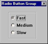
The following example adds a group of three radio buttons with IDs 301, 302, and 303 to the dialog (see Sample Radio Button Group):
MyDialog = .UserDialog~new
MyDialog~Create(100,100,80,60,"Radio Button Group")
MyDialog~AddRadioGroup(301, 23, 18, ,"Fast Medium Slow")
MyDialog~fast = 1
MyDialog~Execute
AddCheckGroup
>>-aUserDialog~AddCheckGroup(--startId--,--x--,--y--,--+----+--,-->
                                                       +-cx-+

      +------+
      V      |
>--"----text-+--"--+----------------------------------+-- )----><
                   +-,--+------------+--+-----------+-+
                        +-"NOBORDER"-+  +-,--idstat-+
The AddCheckGroup method creates a group of check boxes. See AddRadioGroup for a full description.
- Example:
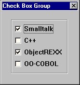
The following example adds a group with four check boxes to the dialog. Two check boxes are preselected (see Sample Check Box Group):
MyDialog~AddCheckGroup(401, 23, 18, ,"Smalltalk C++ ObjectRexx OO-COBOL")
MyDialog~smalltalk = 1
MyDialog~objectrexx = 1
AddInput
>>-aUserDialog~AddInput(--id--,--+----------+--,--x--,--y--,---->
                                 +-attrName-+

>--+-----+--,--cx2--,--+----+--,--text-------------------------->
   +-cx1-+             +-cy-+

>--+---------------------------+-- )---------------------------><
   +-,--style----+-----------+-+
                 +-,--idstat-+
The AddInput method adds an entry line with a label (a static text) to the dialog.
- Arguments:
The arguments are:
- id
The unique ID of the entry line
- attrName
The attrName is used to create an attribute in the dialog object that reflects the contents of the entry line (see AddEntryLine). If it is skipped, the text label is used as the attribute name.
- x, y
The position of the upper-left edge of the label. The entry line is aligned automatically.
- cx1
The length of the label. If omitted, the length is calculated.
- cx2
The length of the entry field
- cy
The height of the entry field. If omitted, the height is calculated.
- text
The label displayed in front of the entry field
- options
Possible options are:
- HIDDEN
Makes the input group invisible
- PASSWORD
Displays the password character instead of the typed-in characters
For further options see AddEntryLine.
- idstat
An ID for the label
- Example:
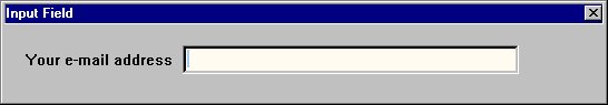
The following example creates an entry field and the label Your e-mail address (placed on the entry field's left side). It also creates an attribute with the name YOUREMAILADDRESS. The height of the elements is calculated. (See Sample Input Field.)
MyUserDialog~AddInput(402, , 20, 30, , 150, , "Your eMail address")
AddInputGroup
>>-aUserDialog~AddInputGroup(--startid--,--x--,--y--,--+----+--,-->
                                                       +-cx-+

         +------+
         V      |
>--,--"----text-+--"--+----------------------------------+--)----><
                      +-,--+------------+--+-----------+-+
                           +-"NOBORDER"-+  +-,--idstat-+
The AddInputGroup method creates a group of one or more entry lines.
- Arguments:
The arguments are:
- startid
An ID that is assigned to the first entry line. Consecutive numbers are assigned to the other entry fields.
- x, y
Position of the input group's upper-left corner
- cx1
Length of the entry field label. If omitted, the length is calculated.
- cx2
Length of the entry field in dialog units
- text
The text strings used for each entry field's label. The single strings are to be separated by blank spaces. This argument determines the number of entry fields in total.
- options
In addition to the options of AddInput, NOBORDER can be used to prevent the method from placing a group box around the group.
- idstat
The ID of the first label. Usually you do not have to specify this value because labels are static controls.
- Example:
The following example creates a four-line input group. The single entry lines are accessible by IDs 301 through 304.
MyDialog~AddInputGroup(301, 20, 20, ,130, "Name FirstName Street City")
Note: If you want to use labels that include blanks (for example, "First Name" instead of "FirstName"), use the AddInputStem method.
AddComboInput
>>-aUserDialog~AddComboInput(--id--,--+----------+--,--x--,--y--,-->
                                      +-attrName-+

>--+-----+--,--cx2--,--+--------+--,--text--,---------------------->
   +-cx1-+             +-clines-+

>--+---------------------------------------------+--)-------------><
   +-,--+-----------------------+--+-----------+-+
        |    +-------------+    |  +-,--idstat-+
        |    V             |    |
        +-"----+-SIMPLE--+-+--"-+
               +-LIST----+
               +-SORT----+
               +-VSCROLL-+
The AddComboInput method adds a combo box and a label string to the dialog.
- Arguments:
The arguments are:
- id
The ID of the combo box
- attrName
The name of the combo box. This name is used as an object attribute name.
- x, y
Position of the group (text string of combo box)
- cx1
Length of the text string
- cx2
Width of the combo box
- clines
Vertical length of the combo box in number of lines
- text
Label being displayed on the left-hand side of the combo box
- options
See AddComboBox
- idstat
The ID of the label. Usually you do not have to specify this value because labels are static controls.
AddInputStem
>>-aUserDialog~AddInputStem(--startid--,--x--,--y--,--+-----+--,-->
                                                      +-cx1-+

>--cx2--,--textStem.--+-------------------------------+--)-----><
                      +-,--+---------+--+-----------+-+
                           +-options-+  +-,--idstat-+
The AddInputStem method adds a group of input fields to the dialog. The difference between this method and the AddInputGroup method is that the titles (and names) of the single lines are passed to the method in a stem variable. Thus it is possible to use strings containing blank spaces.
- Arguments:
The arguments are:
- startid
The ID of the first entry line
- x, y
The position of the whole group (upper-left corner)
- cx1
The length of the text strings. If omitted, the size is calculated.
- cx2
The width of the entry fields
- textStem.
A stem variable containing all labels for the entry fields. The object attribute for each field is created on the basis of this string.
- options
In addition to the options of the AddInput method, NOBORDER can be used to prevent the method from placing a group box around the group.
- idstat
The ID of the first label. Usually you do not have to specify this value because labels are static controls.
- Example:
The following example shows how to use AddInputStem. It creates a four-line input group. For each entry line (with IDs 401 through 404) an object attribute is provided. The names might be different from the title because not all characters can be used for Object Rexx symbols. In this example the NAME, FIRSTNAME, STREETNUMBER, and CITYZIP attributes are added to the object.
FNames.1="Name"
FNames.2="First Name"
FNames.3="Street & Number"
FNames.4="City & ZIP"

MyDialog~AddInputStem(401, 20, 20, , 150, FNames.)
AddCheckBoxStem
>>-aUserDialog~AddCheckBoxStem(--startid--,--x--,--y--,--------->

>--+----+--,--textStem.--,--max--+----------------+------------->
   +-cx-+                        +-,--+---------+-+
                                      +-options-+

>--+---------------------------------------------------------+-->
   +-+-----------------------------------------------------+-+
     +-,--+--------+--+----------------------------------+-+
          +-idstat-+  +-,--+----------+--+-------------+-+
                           +-fontName-+  +-,--fontSize-+

>--)-----------------------------------------------------------><
The AddCheckBoxStem method creates a group of check box controls. Unlike the AddCheckGroup method you pass the titles of the check boxes in a stem variable instead of using a string. Thus you can use labels including blanks.
- Arguments:
See AddCheckGroup for a description of the arguments. The new arguments are:
- textStem.
A stem variable containing all labels for the check boxes. The object attribute for each check box is created on the basis of this string.
- max
The maximum number of check box items in one column. If textStem has more items than max, a second column is created.
- fontName
The name of the font used within the dialog
- fontSize
The size of the font used within the dialog
- Example:
The following example creates a three-column check box group:
CBNames.1="C"
CBNames.2="Pascal"
CBNames.3="Cobol"
CBNames.4="Rexx"
CBNames.5="Basic"
CBNames.6="Fortran"

MyDialog~AddCheckBoxStem(501, 20, 20, ,CBNames, 2, ,
"NOBORDER", 551, "Courier New", 12)
AddRadioStem
>>-aUserDialog~AddRadioStem(--startid--,--x--,--y--,--+----+--,--textStem.--,--max-->
                                                      +-cx-+

>--+-------------------------------------------------------------------------+-->
   +-,--+---------+--+-----------------------------------------------------+-+
        +-options-+  +-,--+--------+--+----------------------------------+-+
                          +-idstat-+  +-,--+----------+--+-------------+-+
                                           +-fontName-+  +-,--fontSize-+

>--)-----------------------------------------------------------><
The AddRadioStem method adds a group of radio button controls to the dialog.
See AddRadioGroup for a description of the arguments and an example.
AddScrollBar
>>-aUserDialog~AddScrollBar(--id--,--x--,--y--,--cx--,--cy------>

>--+------------------------------+-- )------------------------><
   |       +-----------------+    |
   |       V                 |    |
   +-,--"----+-VERTICAL----+-+--"-+
             +-HORIZONTAL--+
             +-TOPLEFT-----+
             +-BOTTOMRIGHT-+
             +-TAB---------+
The AddScrollBar method adds a scroll bar to the dialog.
- Arguments:
The arguments are:
- id
This must be a unique number
- x, y
The position of the upper-left corner relative to the dialog's client area measured in dialog units
- cx
The horizontal size of the scroll bar in dialog units
- cy
The vertical size of the scroll bar
- options
The last argument can be one or more of:
- VERTICAL
The scroll bar is positioned vertically (default)
- HORIZONTAL
The scroll bar is positioned horizontally
- TOPLEFT
The scroll bar is aligned to the top left of the given rectangle and has a predetermined width (if vertical) or height (if horizontal)
- BOTTOMRIGHT
The scroll bar is aligned to the bottom right of the given rectangle and has a predetermined width (if vertical) or height (if horizontal)
- TAB
The scroll bar is assigned a tab stop
AddButtonGroup
>>-aUserDialog~AddButtonGroup(--x--,--y--,--+----+--,--+----+--,--"-->
                                            +-cx-+     +-cy-+

   +---------------------+
   V                     |
>----text-- --id-- --msg-+--"---------------------------------------->

>--+-------------------------------+--)-----------------------------><
   +-,--+--------+--+------------+-+
        +-bottom-+  +-,--options-+
Use the AddButtonGroup method to add more than one push button at once to the dialog. The buttons are arranged in a row or in a column.
- Arguments:
The arguments are:
- x, y
The position of the entire button group
- cx, cy
The size of a single button. One or both arguments can be skipped. If so, the default values (cx=40, cy=12) are taken.
- text ID msg
These arguments are interpreted as one string containing three words (separated by blanks) for each button. The first word is the text that is displayed on the button, the second is the ID of the button, and the third is the name of a message that is sent to the object whenever the button is clicked. The fourth to sixth words are for the next button, and so forth.
- bottom
This is a flag to switch between a vertical (=0) or horizontal (=1) placement of the buttons.
- options
If DEFAULT is used, the first button becomes the default button. For the other options, see AddButton.
- Example:
The following example creates three buttons (Add, Delete, and Update):
MyDialog~AddButtonGroup(20, 235, , , "&Add 301 AddItem"  ,
"&Delete 302 DeleteItem"  ,
"&Update 303 UpdateItem")